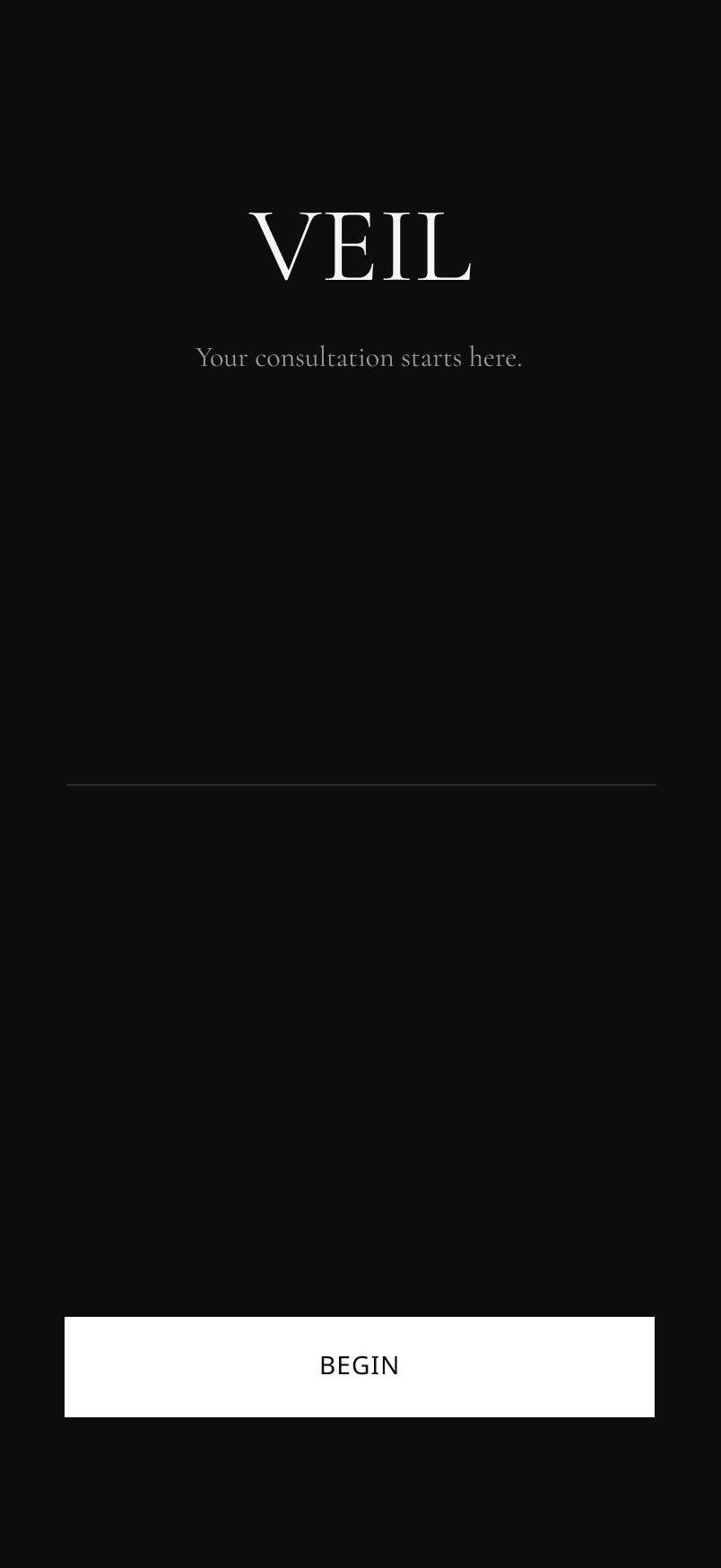

Most booking apps treat a tattoo appointment like a haircut. Veil doesn't. Built for tattooers by a tattooer, it's designed around the consultation process that gets clients to the shop prepared
Problem.
Tattoo clients frequently arrive at consultations unprepared. They come without references, without a realistic sense of what tattoos cost, and without a clear understanding of what makes a design work for their body. Current booking platforms like Vagaro treat tattoo appointments like any other service appointment, collecting a date and a name and nothing else. This leaves artists spending the first half of every consultation on education and expectation setting instead of the creative work they were hired to do. For a permanent, high-stakes service built entirely on trust and collaboration, that gap is a serious design failure.
Research.
Formal user interviews weren't necessary for this project. Sixteen years of client consultations gave me the research foundation most designers would need months to build.
Every consultation I've run as a tattooer follows the same pattern. Clients come in with vague ideas, unrealistic budgets, and no references. I've spent years figuring out how to get the information I need before someone sits in my chair so we can skip the back and forth and get to the work.
I validated those patterns against real Vagaro user reviews, which surfaced the same problems I've lived: a booking flow that collects nothing useful, no pricing context for first-time clients, and no way to gather references before the appointment. The research wasn't a phase I ran through. It was already done.
Define.
My client for this project is someone I know well. I've tattooed them hundreds of times.
Jordan is 27, works in tech, just moved to Austin. Found me on Instagram, has an idea and an open spot on their forearm. Not lost, just inexperienced. No frame of reference for cost, sizing, or how to articulate what they want.
That gap between what Jordan thinks they want and what actually works on a body is what this app is designed to close before they walk through the door.
Mapping Jordan's journey made the problem obvious. Every touchpoint from Instagram to deposit happens over DMs, manually, on my time. Questions get missed. The deposit policy lands at the last second. No system is working for anyone.
Veil fixes that.
Design.
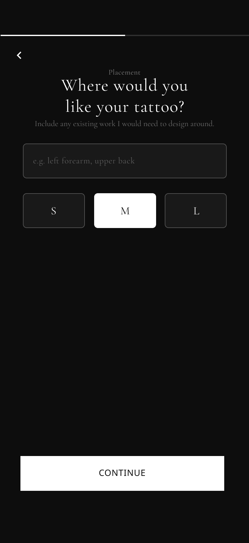
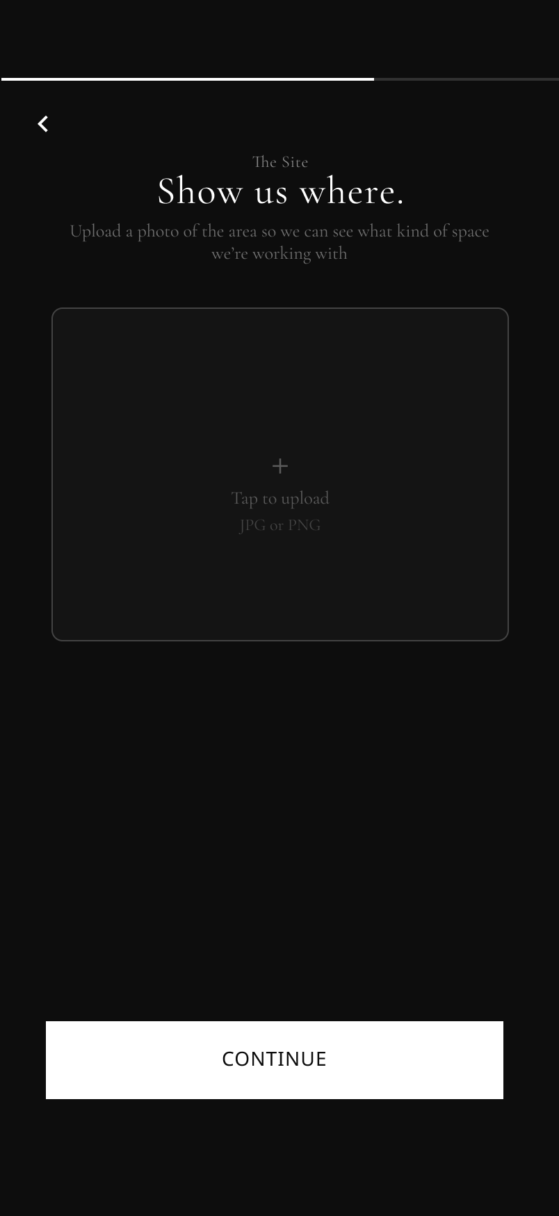
The intake flow started with a simple question: what do I actually need to know before someone sits in my chair? The answer became the app. Name, placement, size, references, a photo of the area, budget, and availability. Seven steps, no back and forth, no missed questions.
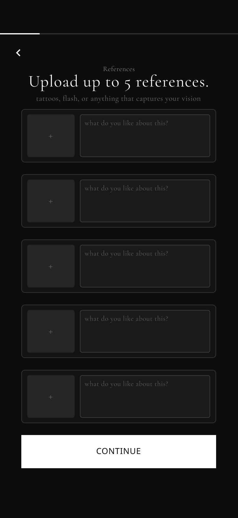
Reference uploads include a required description prompt for each image. 'What do you like about this?' sounds simple but it's the most important question in any consultation. It forces clients to think before they arrive instead of shrugging at me in person.
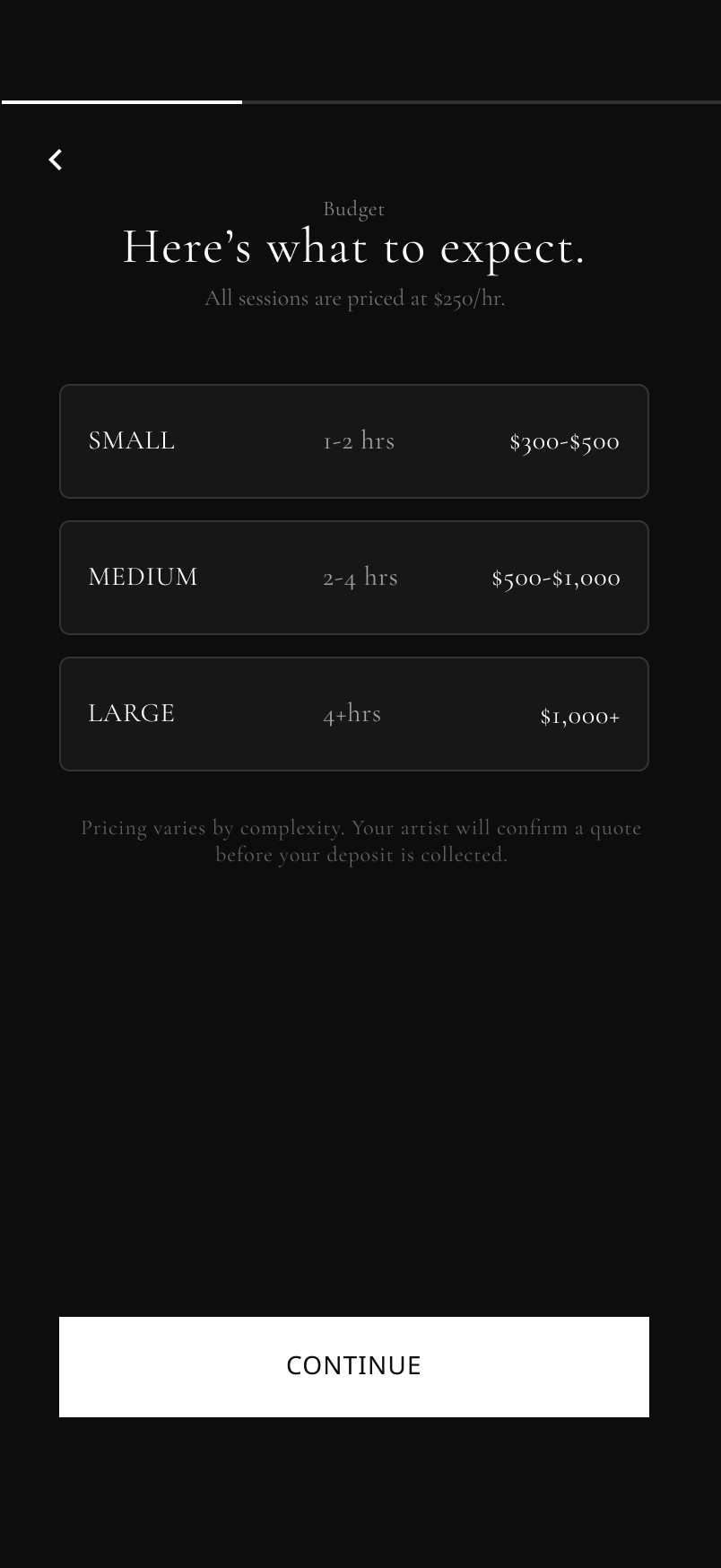
The budget screen exists because most first-time clients have no idea what tattoos cost. Before asking for a number, Veil shows them what small, medium, and large sessions typically run. That one screen eliminates the most awkward moment in every consultation.
Size selection uses the same S, M, L language introduced in the budget screen. The consistency is intentional. By the time Jordan picks a size they already understand what it means in time and money.
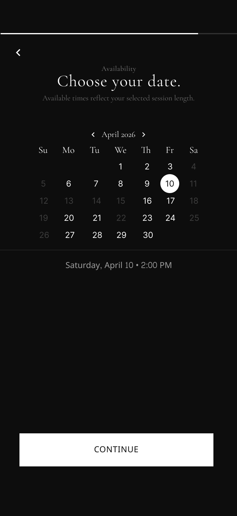
The availability screen uses a calendar instead of a list of time slots because a list feels like a spreadsheet. A calendar feels like a considered product. Available dates reflect the session length Jordan already selected, so they only see what actually works.
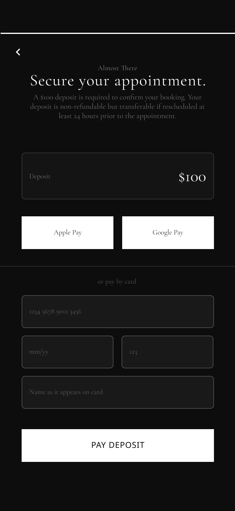
The deposit screen presents the policy before asking for payment, not after. Non-refundable but transferable with 24 hours notice. Jordan knows what they're agreeing to before they tap Pay Deposit.
The confirmation screen is the simplest screen in the flow for a reason. Jordan just committed to something permanent. They don't need more information. They need to feel like they made the right call.
Outcome.
Veil doesn't just make booking faster. It changes what the artist walks into every consultation knowing.
Before a client taps Begin, they've uploaded references, selected a size they understand, shown me where on their body they want the work, and set a budget with realistic expectations. By the time they walk through the door we're already 20 minutes into a consultation that used to start from zero.
If Veil shipped, I'd measure success through a few key metrics: reduction in pre-appointment DM exchanges, deposit completion rate, and client show rate for consultations. The current flow creates no accountability. Veil creates it at every step.
One intentional design decision worth noting: secondary text contrast was kept low to establish visual hierarchy. In a production environment that would be revisited against WCAG AA standards, with increased font weight or size used to maintain hierarchy without sacrificing accessibility.
The client-facing booking flow is only half the product. The natural next phase is an artist-side web dashboard covering availability management, deposit tracking, client history, and portfolio setup. Veil is a platform, not just an app.